Media Studies – Coursework – Evaluation Adam Amini
My chosen brief involved making a promotional package for a Film, including a film trailer, a poster for the film and a website homepage design. The processes of researching, planning and producing my promotional package are all found on my blog (http://adam-amini-mediaa2.blogspot.com/).
Before starting the production of my texts, I researched genre, audience and the conventions of my chosen genre (a mockumentary horror film). My audience is the same target audience as mainstream horror films, so males and females, within the age range 15-30, from many different backgrounds and social standings, as the person’s personal interests affect whether they want to see the film or not, (so the people in the audience are usually fans of the horror genre). The fact that my film is a horror mockumentary will affect the audience, as it is only recently that mockumentary films have gained a mainstream audience, so there would still be people who aren’t in the mainstream audience, from many different ages, genders and backgrounds who are interested in more experimental, less mainstream styles of film, who would perhaps be interested in my film.
In my genre conventions post, I had to research the conventions of mockumentary films and horror films, discussing how they could be linked to form the genre of my text. My main findings from this were that the main purpose of the mockumentary conventions are to create a realistic diegesis, and with a combination of self-reflexive techniques (such as characters purposefully breaking the fourth wall to bring in the audiences,) and stylistics which influence the realistic diegesis, (such as handheld camera, everyday locations and shots which are conventional of documentaries, such as medium close-ups of a presenter). These conventions were coupled with the main conventions from horror films, which are the use of stylistics to incite fear, tension, suspense and shock in the audience. These include music and sound techniques, such as long, drawn out low pitch music to build suspense and sudden crescendos to create fear and/or shock, and to release the tension. Cinematography and editing are also very important in the horror genre, shots such as handheld shots, to create disorientation in the audience, and to make the horror seem more realistic, are coupled with fast paced editing to create a climactic atmosphere, and also slower paced editing is used for similar effect to the music, to build suspense and tension, making the film more atmospheric. As the trailer’s purpose is to present to the audience a general idea of the genre, narrative and atmosphere of the film, I can implement the conventions I found in my research and use them at different times for the different effects.
One of the main ways I researched how to use the conventions of horror and mockumentary promotional trailers, posters and website homepages, is through textual analysis. I analysed the trailers for the mockumentary horror films ‘[.REC]’, (Jaume Balaguero, 2007), ‘The Blair Witch Project’ (Daniel Myrick ad Eduardo Sanchez, 1999) and the mockumentary drama film ‘Live!’ (Phil Guttentag, 2007). I also analysed posters of the film [.REC] (as it is the same genre) and the films Hereafter and Legion, as I decided to make a billboard size poster, and the posters for the aforementioned films were the best examples I could find within the specific sizes. I analysed the websites for [.REC] and Quarantine (the American remake), so that I could gain an understanding of the codes and conventions to apply to my ancillary texts.
My main findings regarding the conventional use of stylistics in the horror mockumentary trailers, was the fact that the use of stylistics in the openings of the trailers were very conventional for normal mockumentary film (i.e. incorporating eclectic borrowing and taking from the conventions of documentaries,) and then as the narrative and premise of the specific film is revealed (as is conventional for a normal trailer,) some of the stylistic elements associated with horror, (or the respective sub-genre) are incorporated. This is shown by the fact that all three of the trailers I analysed opened with some form of graphic or text. In [.REC] and The Blair Witch Project trailers, the text revealed information about the back story of the apparently real footage the mockumentary films are comprised of. In ‘Live!’ the opening of the trailer was a mock title sequence for the fictional television show which is the main narrative drive of the film. While examples of non-diegetic items on the screen, each of these reinforces the realism of the mockumentary, as they are conventional to what we expect to see in a factual media text.
The cinematography of the openings of the trailers was also interesting, as in all three of them the camera shots were mainly medium shots, or medium close-ups of a presenter or person being interviewed. This use of shots both created a more realistic atmosphere, and introduced the characters. The biggest example of this is the medium shot of ‘Angela Videl’ in the [.REC] trailer, when she is talking about what the television programme she presents is. This shot is very conventional when regarding mainstream television, so its placement within the diegesis of a mockumentary film supports the idea of realism. In the two horror trailers, after the initial premise is establish (so in [.REC], the apartment building where they are trapped, and in Blair Witch, the idea of the three filmmakers going into the forest,) the cinematography becomes less conventional and more representative of the horror genre. For example, handheld shots are coupled with fast-paced editing which helps to add to the realism (thanks to the handheld camera) and the faster pace disorientates the audience and is a convention of the more climactic moments in horror films. The cinematography of my trailer also borrows from the conventions of mainstream documentaries, in the fact that there are frequent close-up shots of characters, which intensify the emotions they are showing, and projects their fear, sadness or fright onto the audience.
Cantered angles are also used throughout to disorientate and confuse the audience. These appear in several of the handheld shots in all texts, as the character who is (within the diegesis) controlling the camera moving around the environment. Within the context of the film the angles appear accidental and reflect the fear of the characters and the horror of their situation. In the [.REC] trailer, many of the shots involving the characters fleeing from the zombie-like antagonists involve both shaky handheld camera and cantered angle shots. In ‘Live!’ a cantered angle is shown briefly in one excerpt of narrative to give a voyeuristic fly on the wall effect. This was a useful reference in my trailer, as in my initial ideas the ‘haunted house’ being investigated in fitted with C.C.T.V. Cameras which, when included within the trailer would add a feeling of voyeurism, further drawing the audience in as the idea of them looking in on the events draws them in even more, making them feel more involved. This involvement further aligns the audience to the characters and the situation, meaning than once the horror unfurls the audience (with their amplified alignments,) will feel a more intense horror than they originally would have done.
The mise-en-scene of all three of the trailers consists of everyday settings and locations, adding a sense of realism and familiarity. These include Heather’s home in ‘The Blair Witch’, the apartment block in [.REC] and the various homes and workplaces shown in ‘Live!’ when the contestants in the fictional program are introduced. The familiar settings add to the mockumentary feel, as if a program is meant to be factual, it would obviously have real life settings. The real life situations also contrast heavily with the sheer horror or drama present in all three films, so that when the horrific or dramatic events run their course, the emotional response in the audience is much heavier. The only of the three films to have a somewhat unfamiliar setting is the majority of ‘The Blair Witch’, which is set in the forest. The unfamiliarity, which contrasts with the familiarity of the home and town shown earlier in the film, adds to the feelings of horror and suspense in the audience, as they feel like they shouldn’t be witnessing the events, in such a frighteningly unfamiliar setting.
The sound of mockumentaries, as they are representative ‘reality’ is mostly diegetic. These include dialogue of characters onscreen, and ambient sounds, such as people in the background. This adds to the realism of the text. Unnatural noises are often onscreen but still within the diegesis. These include the animalistic screams of the ‘zombies’ in [.REC]. Non-diegetic sound is used in the trailers as background music which in [.REC] helps reflect the horror and tension when low pitch, fast paced sounds are coupled with fast paced editing to reflect the intensity of the horror in the film. In ‘Live!’ the non-diegetic soundtrack initially has a very modern sound and represents the ideology of the film, which is a social commentary/satire on the lengths innovative and modern reality television will go to get ratings. The sound also uses crescendos and silent moments to amplify the intensity of dramatically important moments, such as when there is a close-up shot of a man with a gun raised to his head (the sound emphasises the drama and importance of the shot within the diegesis).
The main conventions I found when textually analysing posters and website homepages for my ancillary texts involved the content and general layout of the texts. I analysed two main different types of poster, which were the more conventional 4-Sheet poster (40” by 60”) and the less conventional 94-Sheet size poster, (480” by 120”). While the 4-Sheet posters were easier to source and analyse, I wanted to make a 94-Sheet poster as I was interested in undertaking a challenge and make something which I had never made before. For the file to be manageable I had to therefore size it down but keep the size ratio present, resulting in my film posters horizontally elongated shape (as it is a smaller-scaled billboard poster).
I found that in the [REC.] poster and website, the mise-en-scene (i.e. the colour scheme, fonts and photographs) all carried on the themes shown in the film trailer. The colour scheme of both texts had a green, unnatural hue, and in all texts scan-lines, static and video noise were present, adding to the realism of the final texts, as it gives the impression that the film was shot compulsively and in unprofessional conditions, and not in a studio or a set, for example. The colours and similar image quality helps show that the two texts and the trailer are all part of one single promotional campaign. I planned on using similar techniques in my texts, such as colour scheme and similar styling of image and text to show that all three of my texts are part of one campaign.
The billboard posters which I analysed were for the films ‘Hereafter’ and ‘Legion’. The poster for ‘Legion’ was very unconventional in both the content and placement of images and texts. The only information given was the release date, title and the picture of the protagonist. The image of the ‘angel’ was central, along with the text (which is unconventional for film posters) and the wings of the man breach the edge of the poster, sticking out. This centrality is also representative of the themes of the film, as it involves religion, and the image is graphically similar to the Christian image of Christ on the Cross. The ‘Hereafter’ poster is quite conventional, with the image on the left fading out into the text which is off centre and therefore more conventional. This poster also has more information including the fact that ‘Matt Damon’ is in the film, and also has institutional information about the production companies involved, the director and distributors. This is similar to the very conventional ‘[.REC]’ poster.
There are many ways in which my trailer abides to the conventions of a mockumentary horror film trailer. The opening has non-diegetic text, establishing the back-story, and explaining how the ‘real’ events the audience are about to see. The cinematography is very conventional for my chosen hybrid genre. The opening shot is a back tracking mid-shot of the presenter of the programme, which is very conventional when regarding real-life documentaries, therefore a convention of the mockumentary genre. After the horror theme is established, the camera shots become handheld and less conventional often using a Dutch tilt or cantered angle to represent the confusion and fear of the characters, and also to disorientate the audience. Many shot types conventional of the horror genre are also used, such as close-ups and extreme close-ups (for example, the final shot showing my female protagonist is an extreme close up at a cantered angle, both disorientating the audience and amplifying the intense emotions of fear the character is feeling).
Editing was also used in a way fitting to the mockumentary horror genre. Non-diegetic titles similar to those present in the ‘Blair Witch’ and ‘[.REC] trailers were used, initially, as I have said, to inform the audience of the back-story, and then throughout the trailer in a very conventional way similar to the ‘[.REC] trailer. The titles have conventional phrases such as “This October” (informing audiences of the release date) and “Prepare for the Horror” (a typical tagline for a horror film). The final titles are the film’s logo, the release date (31.01.2011; Halloween, tying in with the idea of horror and the supernatural which is a theme of the film), and finally, the last title asks the audience to ‘find the truth’ (implying the realism of events) and gives the website URL (Ghosthunter2010.co.uk) the homepage of which is one of my ancillary texts, furthering the promotional campaign as a combination of all three texts. The pace of the editing starts off slowly (the initial shots are quite long,) yet soon picks up speed and gets a quicker pace, which is typical of horror trailers, and represents the fear of the characters and the sheer horror within the film.
The mise-en-scene, being set in the ‘average’ house which is apparently haunted, was typical and familiar to audiences. The everyday house being a familiar setting means that the horror, when it unfolds, has more of an impact on the audience. I considered how I would like the characters represented when deciding on their costume. For example, the male and female presenters are wearing fashionable clothing, which is conventional in television and therefore can be applied to my text, as it is a pastiche of real life programmes, such as ‘Most Haunted Live’ (paranormal investigations broadcast on television). The female owner of the house, Annie, to represent how she is unhappy living in the haunted house is wearing grey, as the colour grey itself connoted sadness and general downcast, negative emotions. The psychic character (which herself is a convention of television programmes such as ‘Most Haunted’,) is wearing black, gothic style clothing, which are loose-hanging and draped; almost lace-like. This type of clothing is playing on the stereotype of psychics and mediums, showing the character in an almost archetypal light. This is almost similar to how having a male and female presenter, almost like a double-act is what people expect to see on television programmes.
Most of the sound in my trailer is diegetic (i.e. the bangs caused by the ‘spirit’, and the dialogue between characters,) but there are many examples of non-diegetic sound which abides to the genre conventions. The main part of the non-diegetic soundtrack is a low pitch, almost ambient background noise, which is very typical of the horror genre, as it helps to build suspense and is also full of sudden crescendos in noise, which are useful when juxtaposed with a sudden horrific event. One interesting non-diegetic noise is a ‘reverse-clang’ sound, which is a metallic clang, played in reverse, which provides a build up to the sudden horror shown both when the male protagonist is dragged off screen, and when the female presenter screams from upstairs. Static noises are also used, to split up the separate scenes (when accompanied with onscreen static noise effects,) and to add to the idea that the footage is real (and therefore full of technical difficulties caused by the haunting).
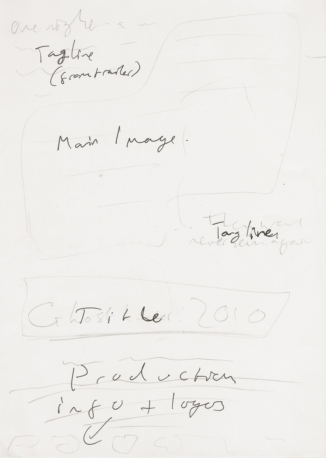
My billboard poster’s layout, with the main image in the left, and the text (the film’s logo, the tagline and the release date,) off-centred to the right and surrounded by institutional information abides by the conventions of a film poster. The colour scheme of the trailer, the poster and my website all consist of a green hue, dark, contrasting lighting full of chiaroscuro and scan lines, static and digital noise on the footage/images. The website has all the conventions of a typical film website homepage. The fonts used in the film trailer and poster (courier, which is used for all non-diegetic text in the trailer, and for all institutional information, taglines and general writing on the poster, as the typewriter effect gives the impression that the information is from some sort of ‘classified’ document about the event), are used on the website as well, continuing the stylistic theme between all three texts. There is a video box in which the audience can watch the film trailer, which is conventional of film websites, and there is also a menu bar at the top, with links such as ‘Social Networking’ and ‘Gallery’ which are all typical of film website homepages.
After researching my genre and deciding on the plot of my imagined film, I had to proceed to draft a script for the trailer. As the trailer is non-continuous, I decided a screenplay would be impractical, so wrote a ‘shooting script’, which can be found on my blog, which has my initial ideas for shots in the order I planned on having them in my trailer, as well as information on the lighting, the scene timings, props, locations dialogue and actions. This both acted as a guide on telling my actors/actresses what to say and do, and also doubled as a shot list to help me organise props, locations and shooting schedules while I was filming. To upload the final script to my blog I use ‘Scribd.com’ which is an online file-hosting website which provides embedded codes for text documents, to allow users to upload them to websites such as blogs.
After completing my shooting script I drafted a hand drawn storyboard of my trailer and then scanned onto a computer the slides, and used Windows Movie Maker software to create an animatic of my trailer. These early visual drafts of my trailer helped give me an idea of how certain shots would work, and they gave me a feel for the pace of the editing and whether certain shots could work being juxtaposed to one another. After being pleased with the results I moved on to filming the shots and starting to make early drafts of my trailer.
The trailer was filmed on a Sony HDV 1080i Camera. To prepare for filming I had to organise the location, which being an average house didn’t provide much difficulty, and then props, which involved gathering items such as laptops (to reflect the technical aspects of the investigation) candles (for the proposed séance scene,) and organising actors, actresses and their costumes. While filming I had to overcome certain problems, such as trying to effectively frame shots in the given environments. An example of a shot i had to compromise is the shot in which the male presenter is dragged off screen. My initial plan was for a very high angle shot, to imply that the camera is a C.C.T.V. camera, but due to the dimensions of the two different rooms in which I tried shooting, I was unable to have the camera at as high an angle as I had originally envisioned. Due to the nature of my film, I also emphasised certain camera movements while doing handheld shots, such as intentionally putting in a cantered angle to reflect the fear and disorientation of the characters, as the camera operator is, in fact a character within the film.
To begin editing I uploaded the footage to a college edit suite, and created a Project film in the Adobe Premier Pro video editing software. I used a wide range of different tools and techniques ranging from the simple, everyday tools, such as the ‘Trim’ tool and the hand tool to drag clips around the timeline, to the more complicated tools which allowed me to get many different effects. For example, the static seen throughout the trailer was created by using an opaque White Matte layer, with dense Black noise (created by the ‘Matrox Old Movie’ tool,) and layering this with a translucent Black Matte layer, with white/grey noise created by the same tool. Once these graphics were coupled with the television static mp3 file, they gave the illusion of realistic static.
The blockier more digital interference present throughout the trailer was created by layering the same video clip above its copy on the timeline, using the crop tool to single out a small section of the video, dragging the clip to a different point within the screen, so that it looks detached, and then using the ‘Slide’ tool to drag it out of sync with the clip below. When done effectively, this created a blockier digital static, like that seen in the [.REC] trailer. Similar effects were used, and coupled with high pitched, sudden technical noises, on the non-diegetic text to create sudden flashes of disoriented text (i.e. the titles were duplicated, layered and offset on the screen).
The final major effects I used were to enhance the lighting and hue of the footage. For the sake of video quality I had to film during the daytime, yet a convention of horror mockumentaries are that they are mostly filmed at night, to amplify the fear of characters and the audience. To fool the audience into thinking that the footage was at night I decided to give it a night-vision effect. This was done by using the hue, brightness and contrast tools to give the footage a green hue (typical of night vision,) and then to change the contrast and brightness of the footage to provide a harsh lighting, full of chiaroscuro which looks like it was filmed at night. Several scenes where the harsh lighting is evident include the still used in my billboard poster, a screenshot from the trailer in which the psychic character is stood at the top of the stairs, silhouetted against a harshly lit wall, surrounded by shadow, and the shot in which the male presenter is dragged away, where the contrast makes what was originally lines of sunlight on the wall, look like harsh strips of moonlight casting shadows across the room. Another lighting effect I used was to create the ball of light on the screen, which looks like the result of a torch on the camera, which makes the footage look even more like it is part of a paranormal investigation television show, increasing the realism of my text.
After completing my first digital draft, (which adhered closely to the script, storyboard and animatic,) and asking audiences what they thought of it, it became apparent that the sense of narrative shown in the trailer was too strong, and that the pacing was too slow. The shots were too long and drawn out, and many parts of the trailer established a too clear idea of linear cause and effect, giving what was supposed to be a trailer a feel of a short film. After considering feedback from audience members and tutors, I decided to heavily edit my trailer. A lot of the different shots were cut down and re-ordered, often split up and used in different parts of the trailer, the pace of the trailer also picked up a lot more towards the end as it reached a climax of sorts, and towards the end of the project it became a much more conventional film trailer, and more like what audiences would expect to see in a cinema.
Audience feedback, after helping me decide to change many aspects of my trailer, was used after completing my texts, to help me see if I was successful in achieving my aim of creating an effective promotional package for a film. While some audience members felt that the trailer was still quite long compared to most film trailers, many members of the audience commented on the effectiveness of the three texts as one promotional campaign, citing the colour scheme, image quality (such as scan lines and hue,) and continuing font styles as helping the unifying theme between the texts, and making it an effective promotional package. The use of conventions in the ancillary texts was also commented on, due to the very effectively conventional layouts (such as the poster having the main image on the left, and the text and logo on the right,)while the fact that the poster itself was a billboard poster and not a typical 4-Sheet was commented upon as well. The editing in the trailer was also complimented, and many audience members commented on the effectiveness of the pace of shots in the final draft when compared with the earlier video drafts. The audience stated that in the final draft it was clear what the narrative and genre of the film were, and that while a sense of the characters identity was not given as strongly as it could have been, this didn’t detract too much from the overall effectiveness of the trailer.
I utilised many different new media technologies throughout the course of this project. These include the many pieces of hardware I used, such as the Sony HDV 1080i camera, the tripod and the edit suites themselves, and many pieces of software, such as Jasc Paint Shop Pro 7 and Adobe Photoshop CS5 which were both used to edit my ancillary texts, and Adobe Premiere Pro which was used to edit the drafts of my video together. Online file hosting websites such as ‘Scribd.com’ and YouTube were used to provide the embedded codes for me to place my work onto my blog, and the website blogger.com itself is a modern website which provides an effective format to display projects such as this one. I also used social networking websites such as FaceBook.com to connect with my target audience and get feedback on earlier drafts of my trailer and ancillary texts, as the main age of the users of FaceBook is 15-30 year olds, which is the age of my film’s main target audience.
Overall, I believe that my project has been a success and that I have created an effective promotional campaign for a film, which abides by the conventions seen in trailer, websites and posters for mockumentary horror films, and which acts effectively as a campaign, due to the similar stylistics and themes shown across each of the texts. I have researched the conventions of the media texts thoroughly and I believe I applied the knowledge I gained effectively, meaning that when it came to producing the texts I had an understanding of the different types of stylistic elements and themes to put in the texts and effectively present the genre and narrative of the film to the audience, and successfully attract the chosen audience for my genre. The main aspect I would change about my trailer is the representation of characters, as in my audience feedback it was said that the trailer doesn’t represent the different types of characters as strongly as it could have done. I believe this is because there was somewhat of an ensemble cast and it is quite difficult to effectively represent many people in such a short space of time. If I were to repeat the project I would consider this more deeply and perhaps find a way to successfully represent all of the characters of the film.